7 Fresh Kitchen Color Schemes 2025 for Budget-Friendly Upgrades
- demoore5506
- Oct 14, 2025
- 11 min read
Did you know that over 60 percent of Canadian homeowners are updating their kitchen colors to keep up with modern trends? Choosing the right shade can change the entire feel of your kitchen, affecting everything from mood to resale value. Whether you prefer serene blues, earthy greens, bold accents, or timeless neutrals, the right palette transforms your kitchen into a welcoming and stylish space that suits your life.
Quick Summary
Takeaway | Explanation |
1. Choose soft neutrals for timeless appeal | Warm beige and greige tones create a versatile, inviting kitchen that feels modern yet classic. |
2. Select calming muted blues for tranquility | Light blue cabinetry evokes serenity and is well-suited for sunny kitchens, enhancing relaxation. |
3. Incorporate earthy greens for a natural vibe | Sage green cabinets connect with nature, offering calm sophistication and supporting well-being. |
4. Use two-tone cabinets for visual interest | Combining contrasting or complementary tones adds depth and personality without a major remodel. |
5. Experiment with bold colors as accents | Jewel tones like emerald and sapphire can create striking focal points that express personality and warmth. |
Table of Contents
1. Choose Soft Neutrals for a Timeless Look
Soft neutrals are the secret weapon for creating a kitchen that feels both modern and timeless. According to recent research from Cabinet Refinishing Canada, Canadian homeowners are increasingly turning to warm beige neutrals like Soft Chamois to transform their kitchen spaces.
Why do soft neutrals work so brilliantly? They create a versatile backdrop that adapts to changing design trends while maintaining a sense of warmth and sophistication. Unlike stark white kitchens that can feel clinical and cold, warm neutral tones introduce depth and coziness without overwhelming your space.
When selecting your neutral palette, consider undertones that complement your existing kitchen elements. Soft beige and warm greige (gray beige) tones offer incredible flexibility. These colors work beautifully with:
Wood grain textures
Stainless steel appliances
Natural stone countertops
Varied metallic hardware
Practically speaking, neutral colors also boost your home’s resale potential. Potential buyers appreciate kitchens that feel inviting yet neutral enough to imagine their own style. A warm neutral palette signals a well-maintained, thoughtfully designed space that feels like home.
Pro tip: Test multiple paint samples in your kitchen’s lighting before making a final decision. Natural and artificial light can dramatically shift color perception, so what looks perfect in the store might appear different in your actual space.
2. Try Muted Blues for a Calming Kitchen
Imagine transforming your kitchen into a serene sanctuary with the power of color. According to recent trends highlighted by Homes and Gardens, light blue and powder blue cabinetry are emerging as top choices for creating a tranquil kitchen environment in 2025.
Blue is more than just a color it is an emotional experience. Soft blue tones have a remarkable ability to evoke calmness and create a sense of peaceful retreat right in the heart of your home. Unlike bold or aggressive colors, muted blues work subtly to reduce stress and promote a sense of relaxation.
When considering blue for your kitchen, focus on nuanced shades that interact beautifully with natural light. Powder blue and soft slate blue can dramatically transform your space without overwhelming it. These colors work exceptionally well in kitchens that receive plenty of sunlight, creating a dynamic visual experience throughout the day.
Practical implementation requires thoughtful selection:
Choose blues with gray or green undertones for sophistication
Pair with white countertops for a crisp clean look
Use metallic hardware in brushed nickel or chrome to complement blue tones
For those worried about blue feeling too cool, consider warmer blue gray tones that introduce depth and warmth. These colors create a balanced environment that feels both refreshing and inviting. By selecting the right shade, you can achieve a kitchen that feels like a calm oasis perfect for cooking preparing meals or simply enjoying morning coffee.
Pro tip: Always test paint samples in your actual kitchen lighting. Natural and artificial light can significantly alter how a blue tone appears, ensuring you select the perfect shade for your unique space.
3. Incorporate Earthy Greens for a Natural Touch
Bring the tranquility of nature into your kitchen with the rising trend of sage green cabinetry. According to Cabinet Refinishing Canada, sage green is quickly becoming a favorite among Canadian homeowners for its ability to create calm and connection with the natural world.
Green is more than a color it is a bridge between indoor living and the outside environment. Earthy green tones like sage offer a unique blend of sophistication and serenity that transforms kitchens from mere cooking spaces into relaxing sanctuaries. These colors tap into the growing biophilic design trend which recognizes our innate human desire to connect with natural elements.
When implementing green in your kitchen, consider the power of two tone color schemes. Pairing sage green cabinets with crisp white elements creates an airy fresh atmosphere that feels both modern and timeless. This approach allows you to introduce color without overwhelming the space.
Practical implementation strategies include:
Select sage green for lower cabinets to ground the space
Use white or light neutral tones for upper cabinets
Incorporate natural wood elements to enhance the organic feel
Choose hardware in brass or matte black for added contrast
Beyond aesthetics green kitchens offer psychological benefits. The color green is associated with renewal growth and balance. By choosing sage tones you are creating a space that feels simultaneously calming and energizing. This makes your kitchen not just a place for meal preparation but a holistic environment that supports wellbeing.
Pro tip: Test multiple green samples in your kitchen lighting. Natural and artificial light can significantly shift green tones from cool to warm creating different emotional responses.
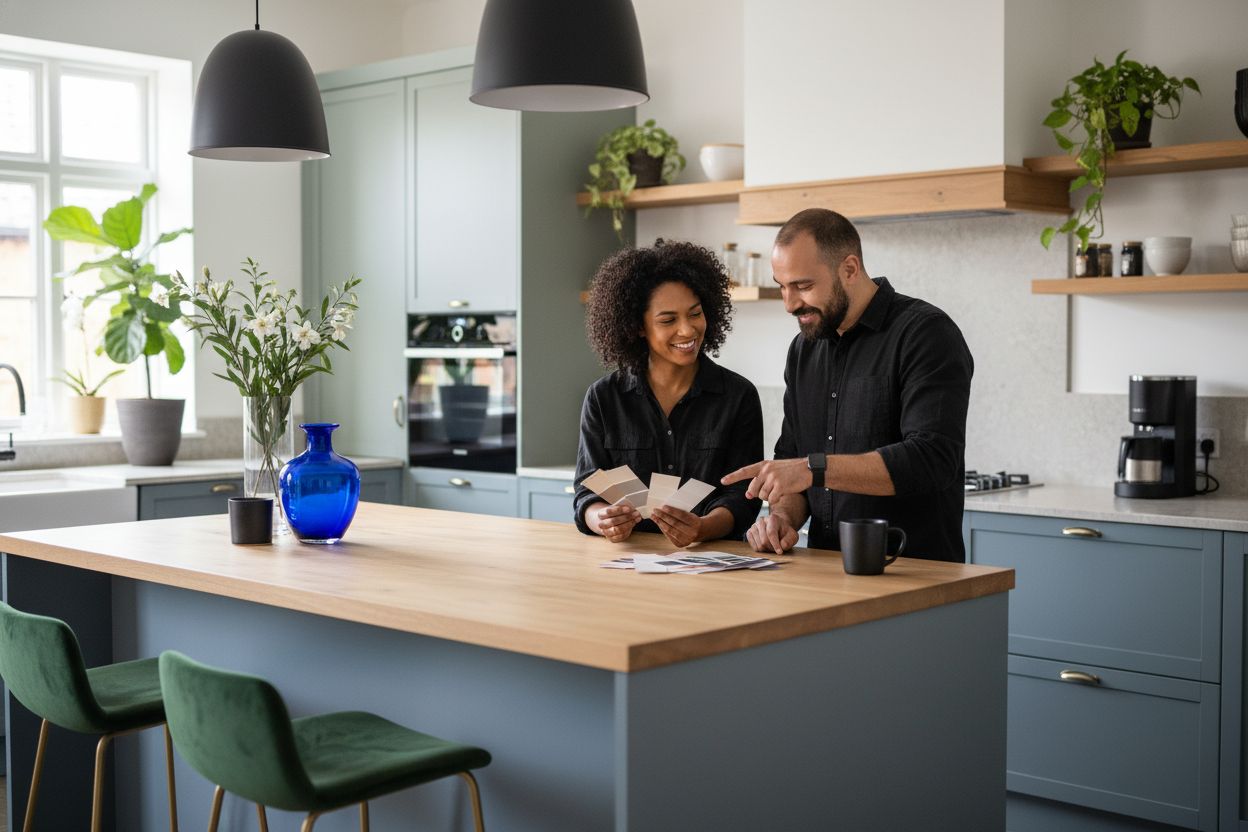
4. Add Depth with Two-Tone Cabinet Colors
Imagine creating visual interest in your kitchen without a complete renovation. Two-tone cabinet colors offer an exciting way to transform your space with minimal effort. Learn more about cabinet color psychology and how strategic color placement can revolutionize your kitchen’s aesthetic.
Two tone cabinets are more than a trend they are a design strategy that adds dimension and personality to your kitchen. By combining complementary or contrasting colors, you create visual depth and architectural interest that makes your kitchen feel custom designed and intentional.
The key to successful two tone cabinets is selecting colors that harmonize yet provide enough contrast to create visual intrigue. Think about pairing lighter upper cabinets with darker lower cabinets or introducing an unexpected accent color on a kitchen island.
Practical implementation strategies include:
Choose neutral base colors with one bold accent
Use lighter colors on upper cabinets to create a sense of openness
Select colors from the same color family for a sophisticated look
Consider your kitchen’s natural lighting when selecting tones
When executing a two tone cabinet design, consider these professional tips. Lighter colors on top visually expand your space making the kitchen feel larger and more airy. Darker tones on bottom cabinets create a grounded sophisticated look that resists showing dirt and wear.
Pro tip: Always test paint samples in your actual kitchen lighting. Natural and artificial light can dramatically shift how colors interact creating unexpected visual effects. Proper preparation and careful color selection will ensure your two tone kitchen looks professionally designed.
5. Experiment with Bold Accent Shades
Welcome to the world of fearless color where bold accent shades can transform your kitchen from ordinary to extraordinary. According to recent design trends from Kent Home Guide, deep jewel tones like emerald, sapphire, and amethyst are making a stunning comeback in 2025 as statement design elements.
Bold accent shades are not just colors they are emotional experiences that breathe life into your kitchen. These rich saturated hues offer an opportunity to express personality and create focal points that draw the eye and spark conversation. By strategically introducing bold colors, you can dramatically alter your kitchen’s atmosphere without undertaking a complete renovation.
Designers are increasingly recommending earthy and jewel tones as sophisticated accent options. As reported by Complete Quality Contracting, colors like olive, oxblood, and plum provide remarkable depth and warmth when applied thoughtfully.
Practical implementation strategies include:
Select one statement area for your bold color
Use bold shades on a single accent wall
Apply vibrant colors to kitchen islands
Incorporate bold hues through backsplash or cabinet panels
When introducing bold colors, consider the emotional impact. Deep emerald green can invoke feelings of nature and tranquility. Rich sapphire blue suggests elegance and depth. Oxblood red communicates warmth and passion. Each color tells a story and creates a unique emotional landscape in your kitchen.
Pro tip: Start small. Use bold colors in limited doses to build confidence. A single olive green cabinet or a plum backsplash can transform your space without overwhelming it. Remember that lighting dramatically influences how these rich colors appear throughout the day.
6. Maximize Light with Clean White Palettes
White kitchens are making a sophisticated comeback in 2025 with nuanced approaches that go far beyond basic stark whites. Explore white kitchen cabinet ideas for modern homes to understand how these palettes can transform your space.
White is not just a color it is a design strategy that amplifies light and creates visual spaciousness. According to research from Cabinet Refinishing Canada, soft white tones like Chantilly Lace remain timeless in Canadian kitchens particularly for their ability to reflect light and boost visual brightness in smaller spaces.
Modern white palettes are all about subtle complexity. Light greige whites such as Sherwin Williams City Loft offer remarkable adaptability. These nuanced shades shift beautifully with changing natural light creating a gentle definition that feels both warm and pristine.
Practical implementation strategies include:
Choose whites with warm undertones for depth
Layer different white shades for visual interest
Use white on cabinets to create an illusion of expanded space
Incorporate textural elements to prevent flatness
When selecting white tones consider how light interacts with your specific kitchen environment. Morning light will render whites differently compared to evening illumination. Whites with slight gray or cream undertones provide more visual complexity than pure brilliant white.
Pro tip: Always test multiple white paint samples in your actual kitchen. Natural and artificial lighting can dramatically transform how white appears creating unexpected variations that can make or break your design vision.
7. Coordinate Walls and Cabinets for Cohesion
Creating a harmonious kitchen color palette is an art that goes beyond simply selecting beautiful individual colors. Learn more about how paint and wallpaper can work together to understand the nuanced approach to color coordination.
Color coordination is not about matching but about creating a visual conversation between your walls and cabinets. According to research from Cabinet Refinishing Canada, professional designers emphasize the critical importance of testing paint samples under real lighting conditions to ensure colors work harmoniously throughout different times of day.
The key to successful color coordination lies in understanding undertones and how different colors interact. Some colors that seem perfect in the paint store can look dramatically different in your actual kitchen environment. Seasonal light shifts can transform how colors appear making your initial selection look entirely different from morning to evening.
Practical implementation strategies include:
Select colors from the same color family
Use a single color with varying shades and intensities
Create contrast through complementary color relationships
Consider the undertones of your existing kitchen elements
When coordinating wall and cabinet colors think of them as partners in a visual dance. Your walls can serve as a backdrop that highlights your cabinets or they can create a subtle background that allows your cabinetry to shine. Neutral tones with slight variations can create depth without overwhelming the space.
Pro tip: Always paint large sample swatches and observe them at different times of day. Natural light morning sunlight afternoon shadows and evening artificial lighting can dramatically alter how colors appear in your kitchen.
Below is a comprehensive table summarizing key color trends for kitchen design and their potential benefits as discussed in the article.
Trend | Description | Key Considerations |
Soft Neutrals | Create a warm, versatile backdrop; complements textures and materials like wood, stone, and metal. | Test paint in various lighting as colors can shift; boosts resale potential. |
Muted Blues | Evokes calmness, works well with sunlight; pairs with white counters and metallic hardware. | Choose nuanced shades; blue can feel cool, so consider warm undertones. |
Earthy Greens | Connects with nature; sage green is popular; biophilic design effects. | Use two-tone schemes; pair with white and wood for balance. |
Two-Tone Cabinets | Adds dimension; uses contrasts for intrigue. | Harmonize lighter top colors with darker bottoms; factor in lighting. |
Bold Accent Shades | Introduces personality with deep jewel tones for focal points. | Apply in limited areas like islands or backsplashes for impact. |
Clean White Palettes | Amplifies light, creates space; nuanced whites like greige. | Mix warm undertones; apply on cabinets to expand space perception. |
Color Coordination | Ensures harmony between walls and cabinets without direct matching. | Consider seasonal lighting effects; test validations under varied light conditions. |
Ready to Transform Your Kitchen With Trending Colors?
Are you inspired by the latest kitchen color schemes for 2025 but worried about the mess, cost, or chaos of a total renovation? Many homeowners dream about bringing in calming blues, soft neutrals, or stylish two-tone cabinets but feel held back by budget concerns or the fear of disruptive projects. The article you just read highlighted how something as simple as a cabinet color change can create a fresh, modern look while boosting the warmth and functionality of your kitchen—the true heart of any home. At Ottawa Cabinet Painting, we specialize in turning those inspiring color ideas into reality, all at a fraction of the cost and hassle of full cabinet replacement. Our professional team combines meticulous preparation with high-end paint and refinishing techniques, offering you a silky smooth finish that is built to last. Worried about disruptions? Our typical process takes about ten days and is designed to minimize impact on your daily life.
Do not wait for your dream kitchen. Discover how easy it is to enjoy trending new cabinet colors and a beautiful, inviting space—without the stress. See how our cabinet painting experts can bring your vision to life, and read more about how color choices influence your kitchen’s vibe with our guide to cabinet color psychology. Ready for a change that fits your budget and style? Get started today at Ottawa Cabinet Painting and book your free quote now.
Frequently Asked Questions
What are the top budget-friendly color schemes for kitchens in 2025?
Soft neutrals, muted blues, earthy greens, and bold accent shades are excellent choices for budget-friendly kitchen upgrades. Choose one or combine these schemes to create a stylish kitchen that feels fresh without a complete renovation.
How can I test paint colors effectively before deciding?
To test paint colors, apply large samples on your kitchen walls and observe them at different times of day. This will help you see how natural and artificial light affects the colors and ensure you are satisfied before making a final decision.
What is the advantage of using two-tone cabinet colors?
Two-tone cabinet colors create visual depth and interest without overwhelming your kitchen. Consider pairing lighter upper cabinets with darker lower cabinets for a sophisticated look that can elevate your space in just a few days.
How can I use bold accent colors wisely in my kitchen?
Start by selecting one area, such as an island or a single accent wall, to apply bold colors. This approach allows you to introduce personality into your kitchen while keeping the overall design cohesive and manageable.
What are some effective ways to incorporate earthy greens into my kitchen design?
Use sage green cabinetry combined with white elements for a fresh, modern look. Focus on using this color on lower cabinets to ground the space, and add natural wood details for a more organic feel.
How do I achieve a cohesive look between my walls and cabinets?
Select colors from the same family or use varying shades of a single color to create a harmonious palette. By applying this technique, you can visually connect your kitchen elements, making the space feel integrated and well-designed.
Recommended
Comments