Two Color Kitchen Cabinets: Stylish Ideas for Ottawa Homes

TL;DR:
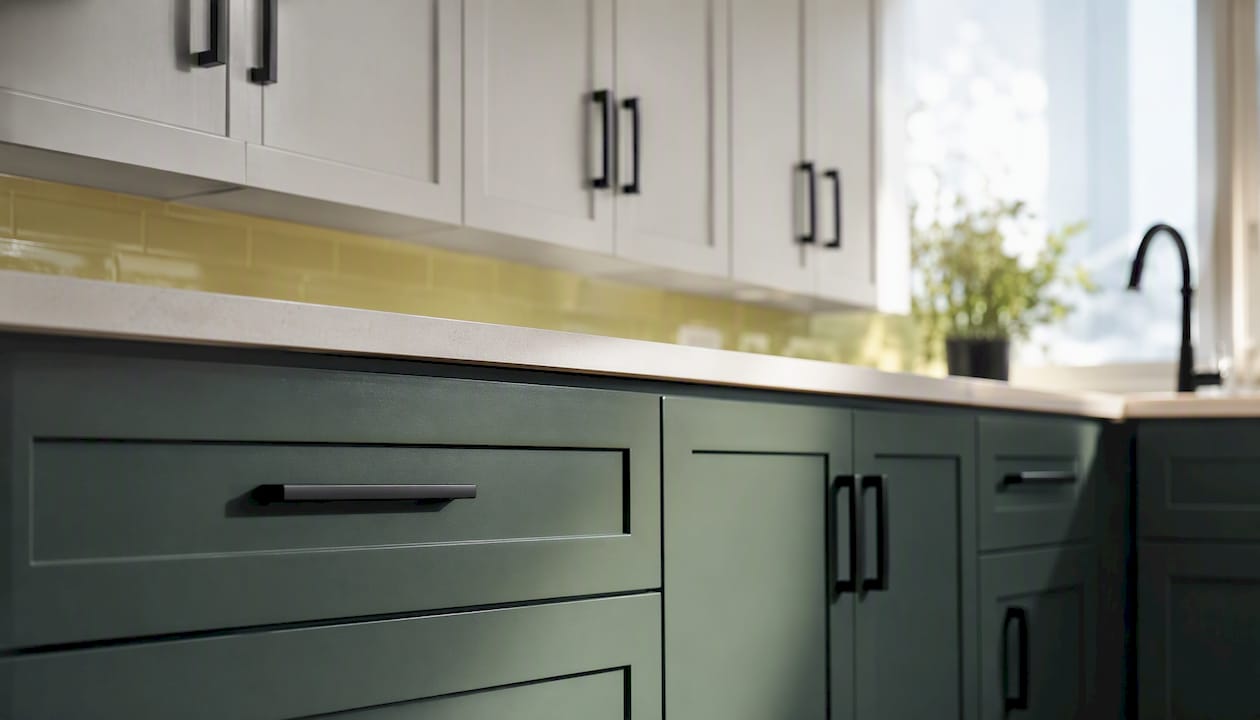
Two-tone kitchen cabinets create depth by pairing one dominant color with a supporting accent. Placing darker lower cabinets and limiting wood tones in the visual line maintain balance and visual appeal.
Two color kitchen cabinets create depth and balance when you pair one dominant finish with one supporting accent. Three rules apply immediately: place the darker color on lower cabinets to ground the room visually, limit yourself to two wood tones in a single eyeline (one is often better), and let your hardware and countertop act as the visual connector between both finishes. Ottawa homes deal with strong seasonal light shifts, so finish choice matters as much as color choice. Ottawacabinetpainting is a local refinishing option for homeowners who want professional execution without a full cabinet replacement.
Table of Contents
Where each color goes in your Ottawa kitchen — and why it matters
Materials, finishes, and execution options for Ottawa homeowners
Common two-tone mistakes and how to fix them in Ottawa kitchens
Where to find two-color inspiration and build a mood board for your Ottawa kitchen
What Ottawa’s seasonal light teaches us about two-tone cabinet design
Where each color goes in your Ottawa kitchen — and why it matters
The dark-bottom, light-top rule is the most reliable placement for two color kitchen cabinets. Darker lower cabinets anchor the room visually, while lighter uppers open the ceiling and keep the space from feeling closed in. It works in almost every kitchen size and ceiling height.
Placement is a proportion decision, not just a style preference. Designers adapt the 60-30-10 rule to two-tone cabinetry: the dominant color covers roughly 60% of visual mass, the secondary color about 30%, and accents like hardware and backsplash the remaining 10%. Get that ratio wrong and the kitchen reads as two competing ideas rather than one intentional design.
Beyond the standard upper/lower split, three other placements work well depending on your layout:
Accent island only: Paint the island a contrasting color while keeping all perimeter cabinets uniform. This works well in open-plan kitchens where the island is already a focal point. The risk is low because you can repaint one piece without touching the rest.
Single run of tall cabinets: Apply the accent color to a pantry column or a floor-to-ceiling run beside the fridge. This draws the eye vertically, which helps in kitchens with lower ceilings.
Painted uppers only: Leave lower cabinets in a natural wood stain and paint the uppers a soft color. This suits smaller Ottawa kitchens where dark lowers would feel heavy.
Ottawa-specific note: north-facing kitchens receive cool, flat light for most of the year. In those rooms, a warm-toned lower cabinet (think greige or warm navy) reads more richly than a cool charcoal, which can look flat by November. South-facing kitchens have more flexibility.
Pro Tip: Before committing to a placement, tape large sheets of colored paper to your cabinet fronts and live with them for two days. Morning and evening light in Ottawa can shift a color’s apparent temperature dramatically.
How to pick two colors that actually look good together
Start with what you cannot change: your flooring, countertop, backsplash, and the direction your main windows face. Every color decision flows from those fixed elements.
Undertone checklist:
Warm woods (white oak, maple) pair with warm paint bases: creamy whites, warm greiges, olive greens, terracotta.
Cool or neutral woods (walnut, cerused oak) pair with cool or neutral paints: navy, slate blue, soft white with gray undertones.
Mixed wood species in one kitchen? Identify the dominant species and match its undertone. The secondary wood should stay in the background.
Swatch-testing steps:
Order or mix sample pots of your two candidate colors. Paint a minimum 12-by-12-inch patch directly on a cabinet door or on primed cardboard held against the cabinet.
Place samples at both the lower and upper cabinet heights, not just on a countertop.
Observe each sample at three times: early morning, midday, and after 6 PM with artificial lighting on.
Check the sample against your countertop edge, your flooring, and any exposed wood trim in the same eyeline.
If the two colors look like they belong to different rooms under artificial light, one of them needs to change.
Limit wood tones to a maximum of two in a single kitchen eyeline. One is often better. Three wood species competing with two paint colors is a recipe for visual noise, not character.
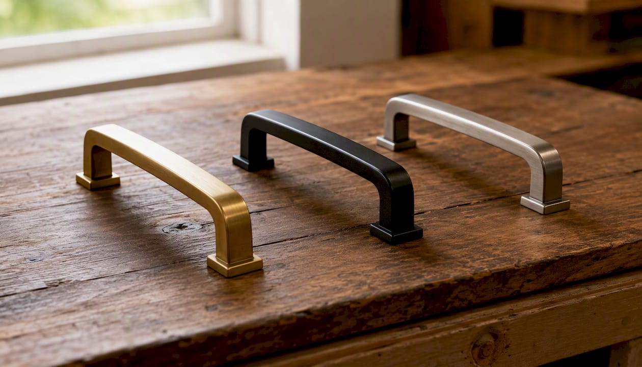
Hardware is the element most homeowners underestimate. Brushed brass unifies warm palettes. Matte black works across both warm and cool schemes. Brushed nickel reads cleanly with cool grays and navy. Choosing hardware that bridges both finishes is one of the fastest ways to make a two-tone kitchen feel intentional rather than accidental.
Practical two-tone palettes for Ottawa kitchens in 2026
Popular two-tone pairings for 2025–2026 include navy lower cabinets with white uppers, forest green lowers with natural oak uppers, matte black with warm wood, and greige paired with charcoal. Each suits a different style.
Palette | Style fit | Hardware suggestion |
Navy lower + white upper | Classic, transitional | Brushed brass or polished nickel |
Forest green + natural oak | Farmhouse, Scandinavian | Matte black or aged brass |
Matte black + warm wood | Modern, industrial | Matte black (match the cabinets) |
Greige + charcoal | Transitional, contemporary | Brushed nickel or chrome |
Warm white + sage green | Cottage, Scandinavian | Brushed brass or ceramic knobs |
For Ottawa farmhouse kitchens, forest green lowers with shaker-style doors and natural oak open shelving is a strong combination. For modern condos or newer builds in Kanata or Barrhaven, matte black paired with a light warm wood veneer reads sharp without feeling cold. Transitional homes in older Ottawa neighborhoods often do best with navy or deep greige lowers against a soft white upper, which respects the home’s existing trim character.
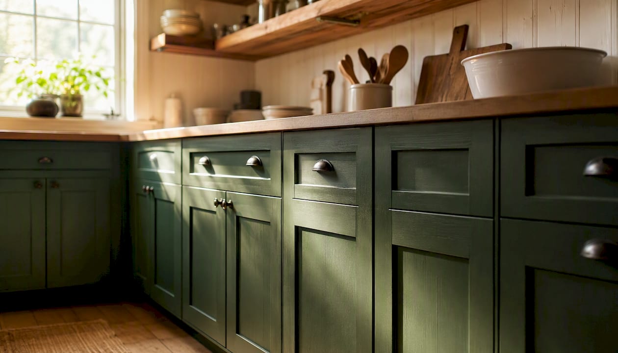
Mood board tip: save wide-angle shots, close-up finish photos, and hardware detail images separately. When you evaluate them against your Ottawa kitchen, note the window direction in each photo. A palette photographed in a California kitchen with year-round sun will look different in an Ottawa kitchen in February.
Materials, finishes, and execution options for Ottawa homeowners
Finish type affects durability as much as color does. Acrylic-alkyd hybrid paints hold up well on MDF and painted wood cabinets. Polyurethane topcoats add scratch resistance on high-traffic lower cabinets. Stained or veneered wood uppers can be left natural and paired with painted lowers, which is one of the most cost-effective ways to achieve a two-tone look without replacing anything.
Execution option | Typical timeline | Disruption level | Durability |
DIY brush/roll | 5–10 days (with dry time) | High | Moderate |
Professional spray refinishing | ~10 days | Low (staged process) | High |
Full cabinet replacement | 4–8 weeks | Very high | High |
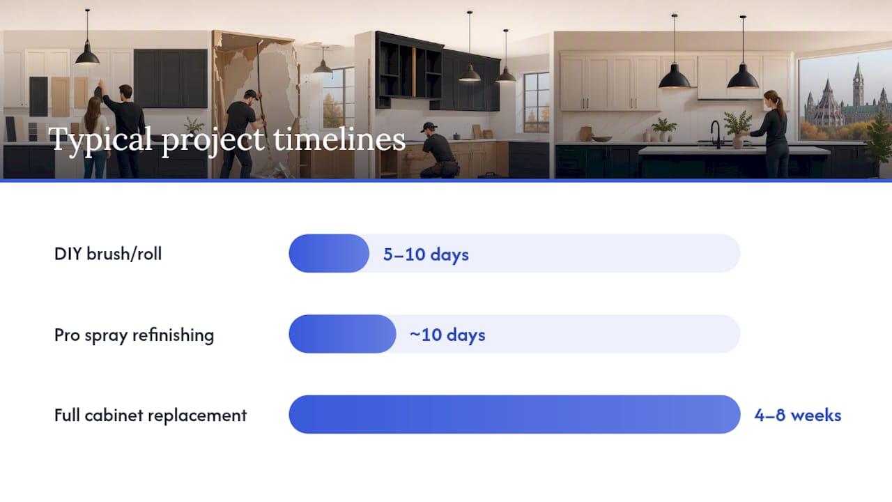
Cabinet painting and refinishing delivers a factory-smooth finish at a fraction of replacement cost. CabinQuartz Canada data shows an average ROI increase of 8–14% from updating cabinets, compared to the cost and disruption of a full replacement.
When to hire a professional:
You want a spray-applied finish with no brush marks or roller texture.
Your cabinets are MDF or have detailed profiles that require careful prep and priming.
You need a warranty on the finish (Ottawacabinetpainting offers a 6-year warranty).
The project involves two distinct paint colors with a clean transition line between them.
You cannot afford 10+ days of kitchen downtime from a DIY attempt with extended dry times.
Common two-tone mistakes and how to fix them in Ottawa kitchens
Most two-tone kitchens that look “off” share the same handful of problems.
Clashing undertones are the most common. A warm beige lower cabinet next to a cool gray upper will fight each other under Ottawa’s flat winter light. Fix: pull both colors from the same undertone family, or use a true neutral (warm white, off-white) as one of the two.
Equal visual weight between both colors removes the dominant/supporting dynamic and makes the kitchen feel unresolved. Fix: apply the 60-30-10 proportion rule and make sure one color clearly leads.
Too many wood tones alongside two paint colors creates clutter. Three wood species in one eyeline is too many regardless of how good each one looks individually. Fix: choose one wood tone and treat the other as an accent or remove it.
Poor hardware choice that matches neither color pulls the design apart. Fix: select a single hardware finish that reads well against both cabinet colors. Matte black is the most forgiving across different palettes.
Ignoring fixed elements like a busy backsplash or a heavily veined countertop. A two-tone cabinet scheme with a complex countertop and a patterned tile backsplash is too much. Fix: if your countertop or backsplash is already a statement, keep both cabinet colors neutral.
On maintenance: spray-applied acrylic-alkyd finishes clean easily with a damp cloth and resist yellowing better than oil-based paints. Lower cabinets, which take more daily contact, benefit from a harder topcoat.
Where to find two-color inspiration and build a mood board for your Ottawa kitchen
The best sources for two-tone cabinet imagery are Pinterest boards filtered by “two tone kitchen Canada,” showroom gallery pages from local Ottawa suppliers, and portfolio pages from local refinishing services.
What to save for your mood board:
Wide-angle kitchen shots that show the full cabinet layout and ceiling height.
Close-up photos of the finish texture (matte vs. satin vs. semi-gloss).
Hardware detail shots that show the metal finish against the cabinet color.
Flooring and countertop combinations visible in the same frame.
Any photo where the window direction or light quality resembles your Ottawa kitchen.
When evaluating inspiration images, ask: does this kitchen face the same direction as mine? A south-facing kitchen in a design magazine will make colors look warmer and richer than they will in your north-facing Ottawa kitchen in January. Adjust your palette expectations accordingly, and always test physical swatches in your actual space before committing.
The Ottawa Cabinet Painting style guide includes before-and-after portfolio examples from local Ottawa homes, which gives you a more accurate reference point than American or European design publications.
Key Takeaways
Two-tone kitchen cabinets succeed when one color dominates, undertones match, and hardware unifies both finishes.
Point | Details |
Dominant/supporting color rule | One color covers ~60% of visual mass; the second covers ~30%; accents fill the rest. |
Undertone matching | Warm woods need warm paints; cool woods need cool or neutral paints. |
Limit wood tones | Keep wood species to a maximum of two in one eyeline; one is usually better. |
Hardware as a bridge | Matte black or brushed brass unifies most two-tone schemes; choose one finish for all hardware. |
Trending demand and ROI | Canadian data shows a 62% year-over-year increase in homeowner demand for two-tone cabinets, a 47% increase in kitchen color experimentation, and an average ROI boost of 8–14% from cabinet updates. |
Ottawacabinetpainting | Offers professional two-stage spray refinishing with a 6-year warranty and a ~10-day timeline. |
What Ottawa’s seasonal light teaches us about two-tone cabinet design
Here is something most design guides skip: color theory works differently in Ottawa than it does in the sun-drenched kitchens you see in American design publications. Ottawa gets roughly 2,000 hours of sunshine per year, but a significant portion of the fall and winter months deliver flat, cool, north-sky light that strips warmth from paint colors. A navy lower cabinet that looks rich and saturated in a Toronto showroom can read almost black in an Ottawa kitchen by December.
We see this play out consistently. Homeowners choose a beautiful cool-toned palette based on magazine photos, then find it feels cold and heavy once the leaves are gone. The fix is not to avoid cool colors entirely. It is to pair them with a warmer supporting color or a warmer countertop material, and to choose a satin or semi-gloss finish on the lower cabinets so they reflect some of that limited winter light rather than absorbing it.
The prep process matters just as much as the color choice. A two-tone finish applied over poorly prepared surfaces will show every flaw under Ottawa’s flat winter light. Full prep, proper priming, and spray application are what separate a finish that looks good in photos from one that holds up through five Ottawa winters. That is why the 6-year warranty Ottawacabinetpainting backs its work with is meaningful. It reflects confidence in the process, not just the product.
Professional two-color cabinet refinishing in Ottawa
Replacing cabinets to get a two-tone look costs far more than refinishing what you already have. Ottawacabinetpainting offers a direct path: two-stage spray painting in your chosen color combination, color-matching to your countertop and flooring, hardware removal and reinstallation, and a 6-year warranty on the finished work. The typical project runs about 10 days with a staged process designed to keep your kitchen functional throughout.
If you want to see what two-tone refinishing looks like on Ottawa homes before you commit, the before-and-after portfolio shows real local projects. When you are ready to get a number, request a free spray painting quote and get a clear picture of what your kitchen could look like without the cost or chaos of a full replacement.
Useful sources and further reading
Imperial Cabinets: Two-Tone Kitchen Cabinet Design Guide — expert rules for dominant/supporting color placement, undertone matching, and wood tone limits.
CabinQuartz Canada: Two-Tone Kitchen Cabinets Trend 2026 — Canadian trend data and popular palette pairings for 2025–2026.
Kitchen Tools Lab: Two-Tone Design Rules and Color Combinations — practical application of the 60-30-10 proportion rule for two-tone cabinetry.
Ottawacabinetpainting: Ottawa’s 2026 Two-Tone Style Guide — local portfolio examples and Ottawa-specific finish guidance.
Check physical finish samples in your own kitchen before finalizing any palette. No online source, including this one, replaces the experience of seeing a swatch under your actual Ottawa light.
Recommended
Comments